What is a Pie Chart ?
-

- by Mcs July 1, 2025
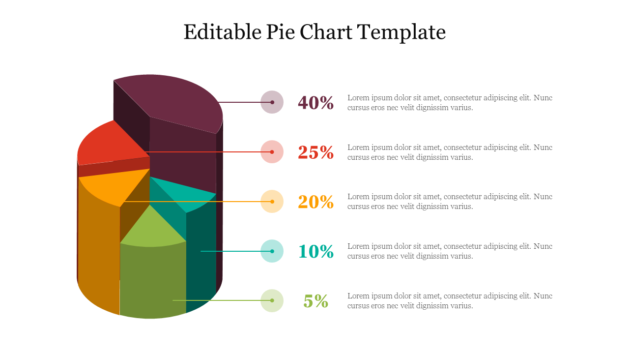
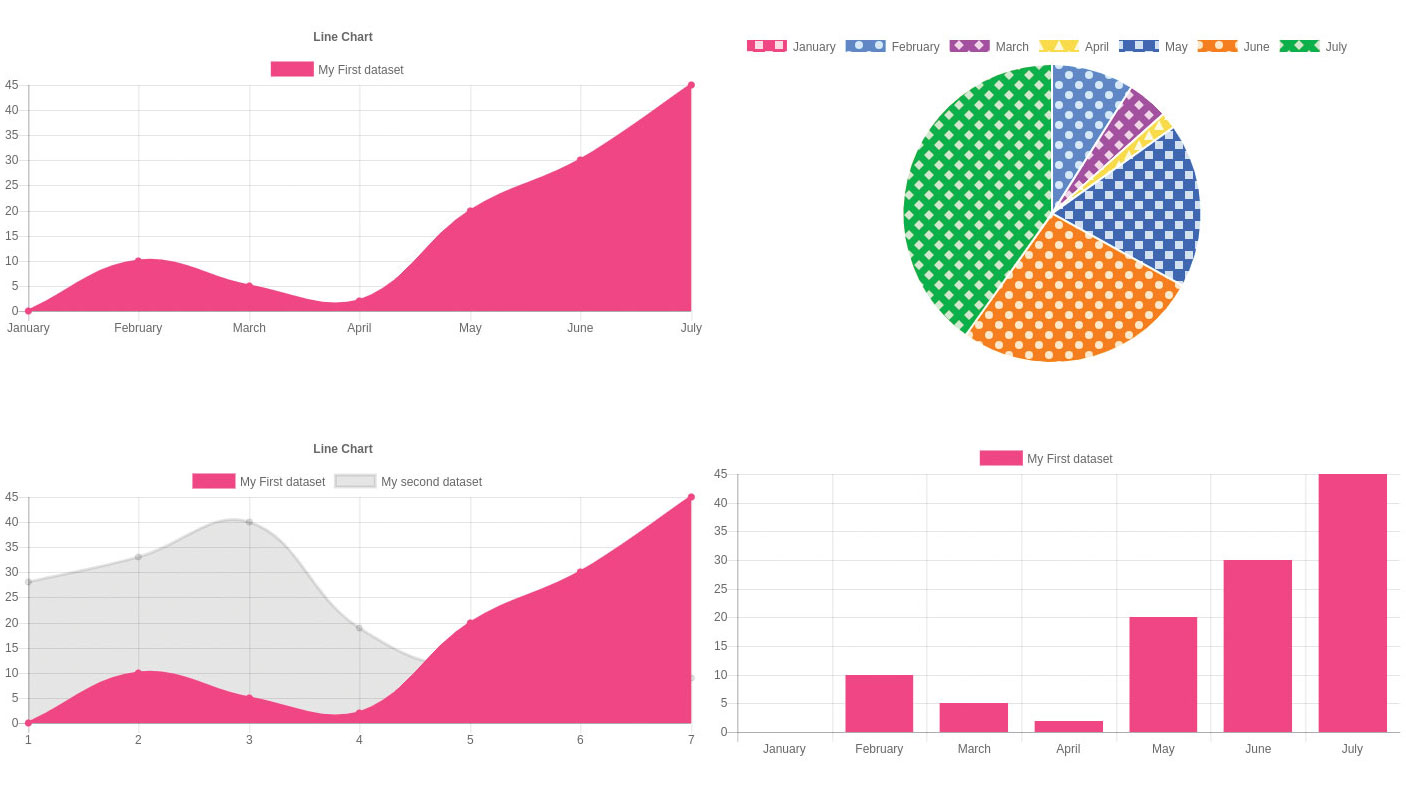
A Pie Chart is a circular chart divided into slices to show proportions of a whole. Each slice represents a percentage or fraction of a category compared to the total.
A pie chart is a circular chart divided into slices, where each slice represents a proportion of a whole. The size of each slice corresponds to the quantity it represents, making it easy to visualize the relationship between different parts of a dataset and their contribution to the total. Essentially, it's a way to show how a whole is divided into different categories or components.
Here's a more detailed explanation:
Circular Shape:
The chart is a circle, and the entire circle represents 100% or the total of the data being represented.
Slices:
The circle is divided into sections called slices, each representing a different category or component of the whole.
Proportional Representation:
The size of each slice is proportional to the quantity it represents. Larger slices mean larger quantities, smaller slices mean smaller quantities.
Visual Comparison:
Pie charts are useful for visually comparing the relative sizes of different parts of a whole.
Common Uses:
They are often used to show how budgets are allocated, how votes are distributed in an election, or the composition of a population.
Limitations:
While visually appealing, pie charts can become difficult to interpret if there are too many slices or if the differences between slice sizes are very small.
Simple Pie Chart with Chart.js
<canvas id="myPieChart" width="300" height="300"></canvas>
<script src="https://cdn.jsdelivr.net/npm/chart.js"></script>
<script>
const ctx = document.getElementById('myPieChart').getContext('2d');
const myPieChart = new Chart(ctx, {
type: 'pie',
data: {
labels: ['Red', 'Blue', 'Yellow'],
datasets: [{
label: 'Colors',
data: [30, 45, 25],
backgroundColor: ['red', 'blue', 'yellow']
}]
},
options: {
responsive: true
}
});
</script>
See More Related Blog
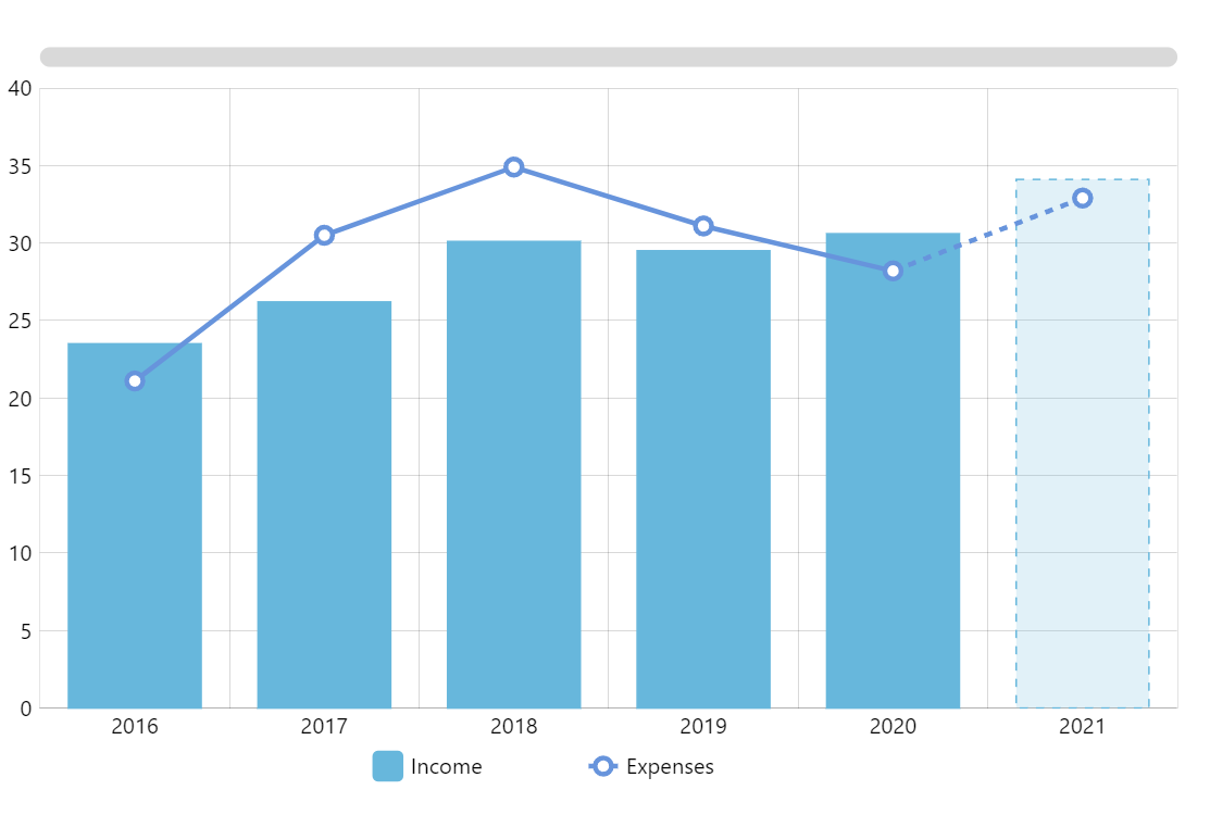
What is a Mixed Chart (Bar + Line) ?
-
- by Mcs
A Mixed Chart allows you to combine multiple chart types (like a bar chart + line chart) in one canvas using Chart.js. It’s perfect for comparing different data series…
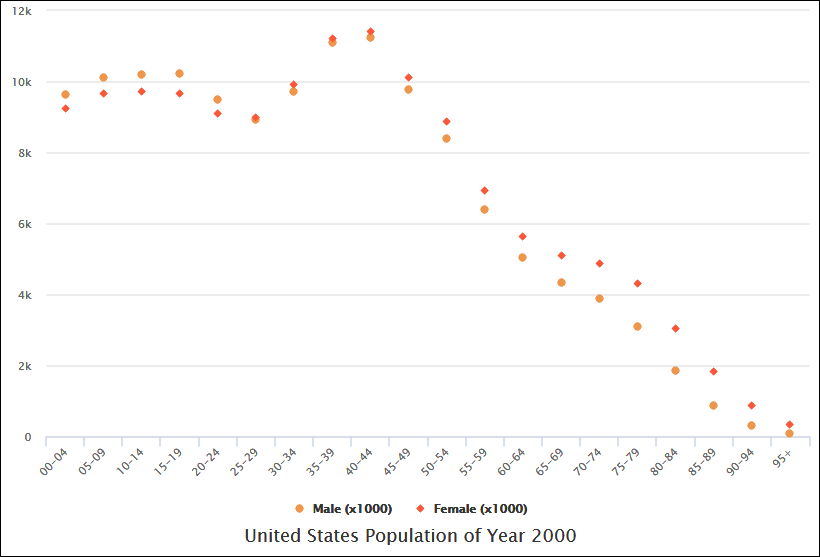
What is a Scatter Chart ?
-
- by Mcs
A Scatter Chart (or Scatter Plot) is a type of chart that displays individual data points on a 2D grid, based on two variables — X and Y.
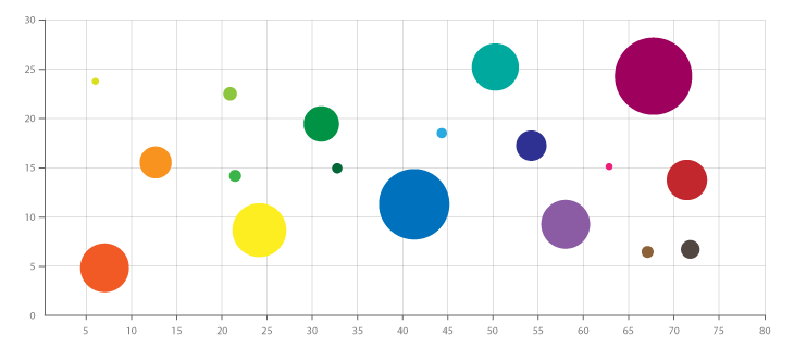
What is a Bubble Chart ?
-
- by Mcs
A Bubble Chart is a type of scatter plot where each point is represented by a bubble, and the size of the bubble represents a third data dimension.
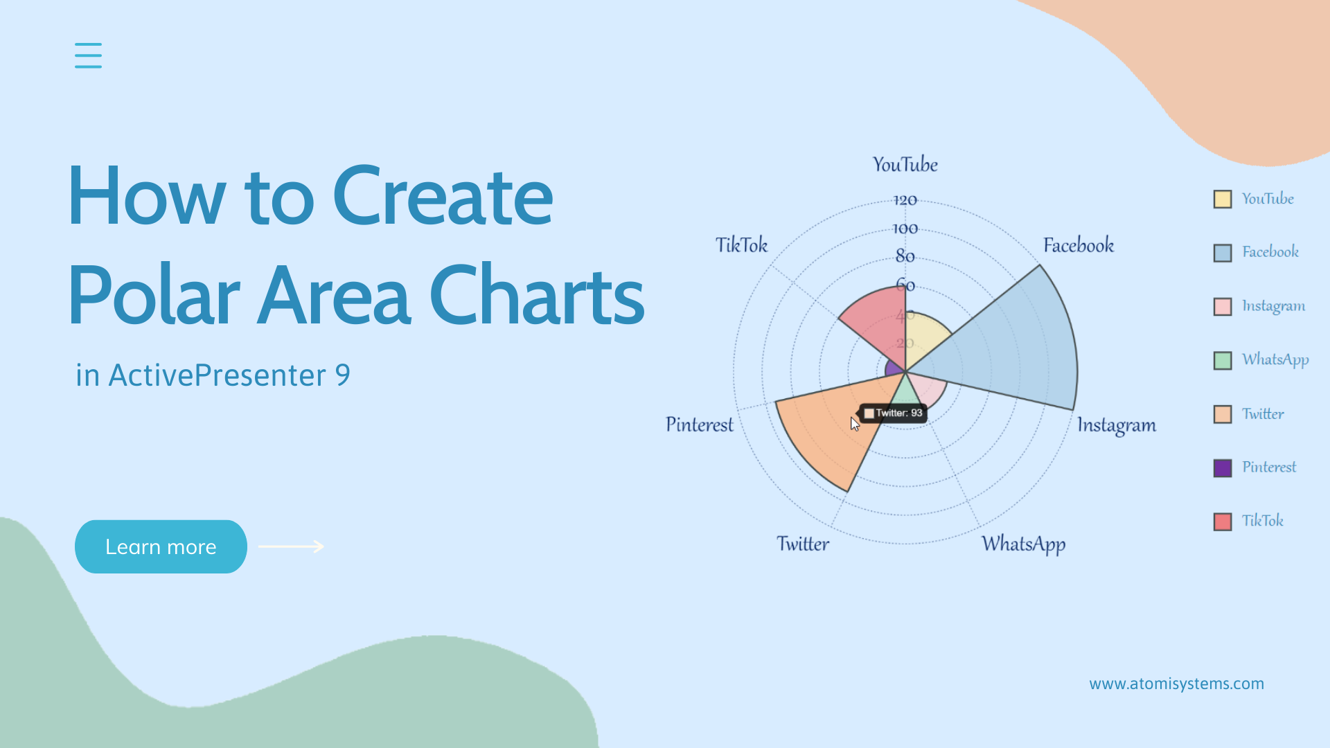
What is a Polar Area Chart ?
-
- by Mcs
A Polar Area Chart is a circular graph similar to a pie chart, but with a twist:
Each slice has the same angle, and its radius represents the value.
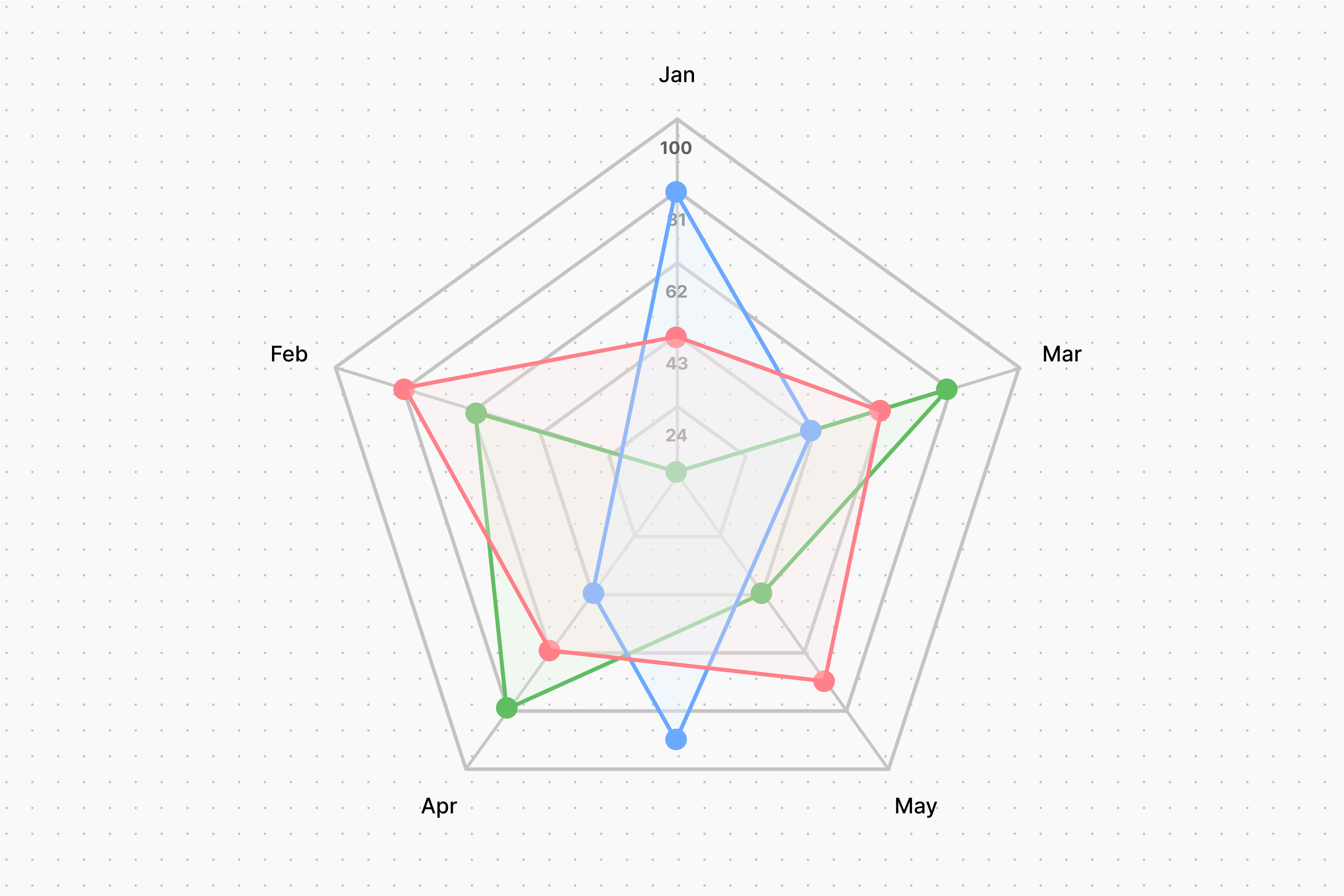
What is a Radar Chart ?
-
- by Mcs
A Radar Chart (also called a Spider Chart or Web Chart) displays multidimensional data on a circular graph. Each axis represents one variable, and values are plotted as…
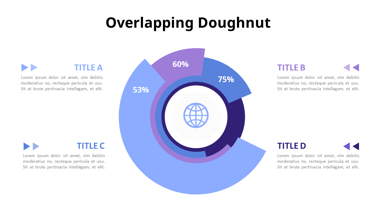
What is a Doughnut Chart ?
-
- by Mcs
A Doughnut Chart is just like a Pie Chart, but with a hole in the center. It shows proportions of data as slices of a ring — useful for comparing parts of a whole (100%).
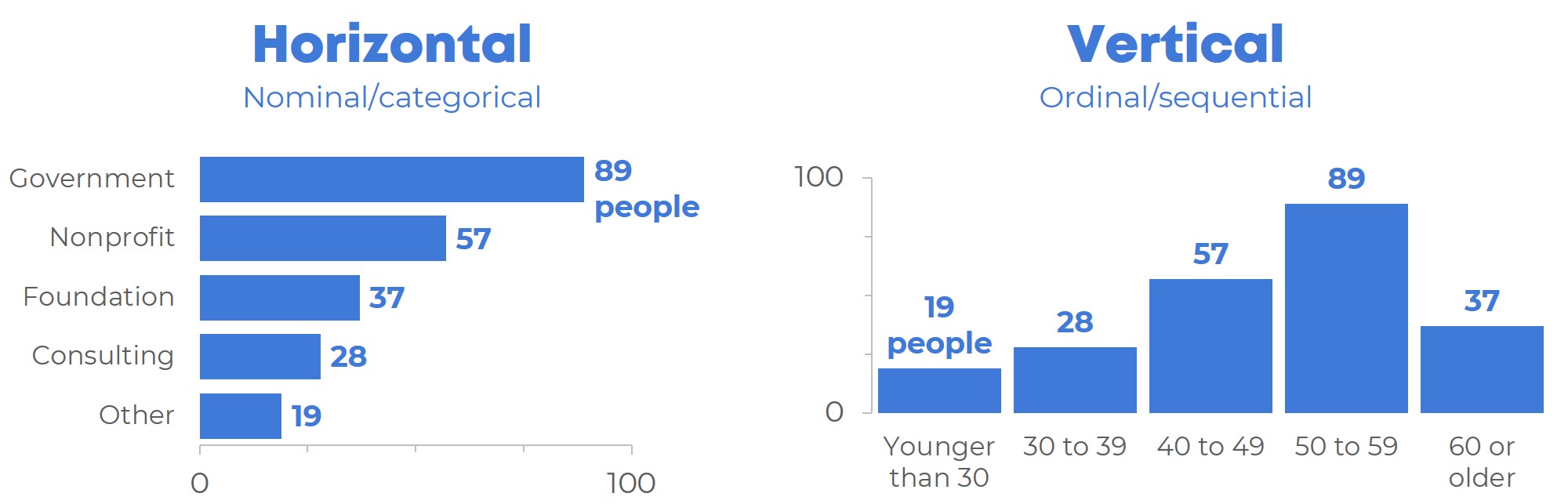
What is a Bar Chart (Horizontal & Vertical) ?
-
- by Mcs
A Bar Chart is a graph that represents data using rectangular bars. Each bar’s length represents the value of the data it shows.
What is a Line Chart ?
-
- by Mcs
A Line Chart is a type of graph that displays information as a series of data points connected by straight lines. It is commonly used to show trends over time.
what is Chart.js ?
-
- by Mcs
Chart.js is a JavaScript library that lets you create beautiful, responsive, and interactive charts using the HTML5 <canvas> element.
We specialize in creating bespoke Drupal websites that are both functional and visually stunning. Our team experienced developers, designers, and strategists works collaboratively to ensure every project meets our high standards of quality and performance.


![]()


@ Mcs. All rights reserved
Comments
Add new comment