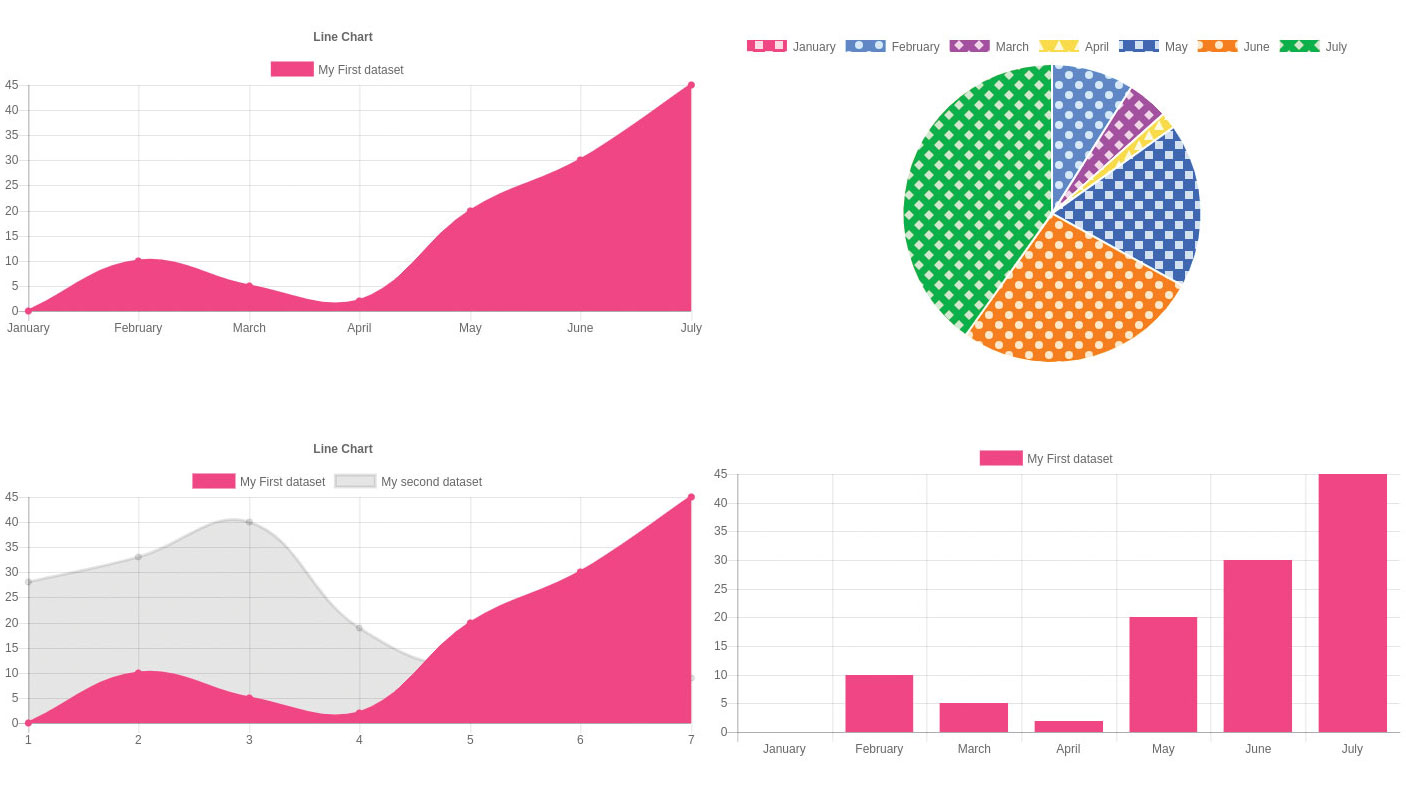
What is a Mixed Chart (Bar + Line) ?
-

- by Mcs July 1, 2025
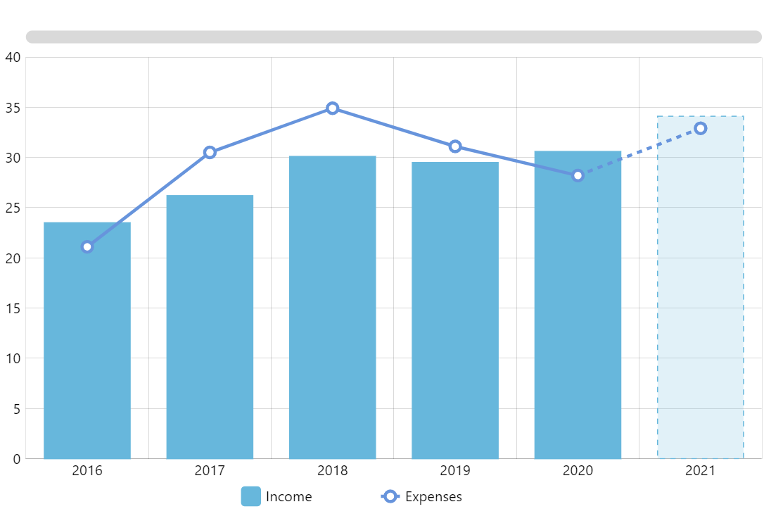
A Mixed Chart allows you to combine multiple chart types (like a bar chart + line chart) in one canvas using Chart.js. It’s perfect for comparing different data series with different styles — like values vs. trends.
A mixed chart (also known as a combination or combo chart) is a visualization that combines different chart types, such as bar and line charts, within a single graph. This allows for the comparison of different data series or the highlighting of trends and comparisons within the same visualization.
Key characteristics:
Multiple chart types:
Mixed charts incorporate elements from different chart types, most commonly bar and line charts.
Shared X-axis:
They typically share a common X-axis, allowing for direct comparison of data across different categories or time periods.
Different Y-axes (optional):
They can also utilize separate Y-axes for each chart type, especially when dealing with data measured in different units.
Versatile for comparison:
Mixed charts are useful for comparing different types of data within the same dataset, highlighting trends, and showing relationships between different sets of data.
Use cases:
- Comparing sales with projections: Displaying actual sales (bars) alongside projected sales (line) over time.
- Showing trends alongside specific values: Illustrating sales trends over time (line) and comparing them to specific target values (bars).
- Analyzing performance metrics: Combining performance indicators (bars) with customer satisfaction scores (line).
- Identifying outliers: Highlighting outliers or unusual data points within a dataset.
- Data visualization for complex information: Presenting diverse datasets with varying scales and units.
Mixed Bar + Line Chart Example (Chart.js)
<canvas id="myMixedChart" width="400" height="300"></canvas>
<script src="https://cdn.jsdelivr.net/npm/chart.js"></script>
<script>
const ctx = document.getElementById('myMixedChart').getContext('2d');
const myMixedChart = new Chart(ctx, {
type: 'bar', // Base chart type
data: {
labels: ['Jan', 'Feb', 'Mar', 'Apr', 'May'],
datasets: [
{
label: 'Sales',
data: [300, 400, 350, 500, 450],
backgroundColor: 'rgba(54, 162, 235, 0.6)',
yAxisID: 'y'
},
{
label: 'Growth %',
data: [5, 8, 6, 10, 7],
type: 'line', // <- Mixed chart magic here!
borderColor: 'rgba(255, 99, 132, 1)',
backgroundColor: 'rgba(255, 99, 132, 0.2)',
fill: false,
tension: 0.3,
yAxisID: 'y1'
}
]
},
options: {
responsive: true,
scales: {
y: {
beginAtZero: true,
position: 'left',
title: {
display: true,
text: 'Sales'
}
},
y1: {
beginAtZero: true,
position: 'right',
title: {
display: true,
text: 'Growth %'
},
grid: {
drawOnChartArea: false
}
}
}
}
});
</script>
See More Related Blog
What is a Scatter Chart ?
-
- by Mcs
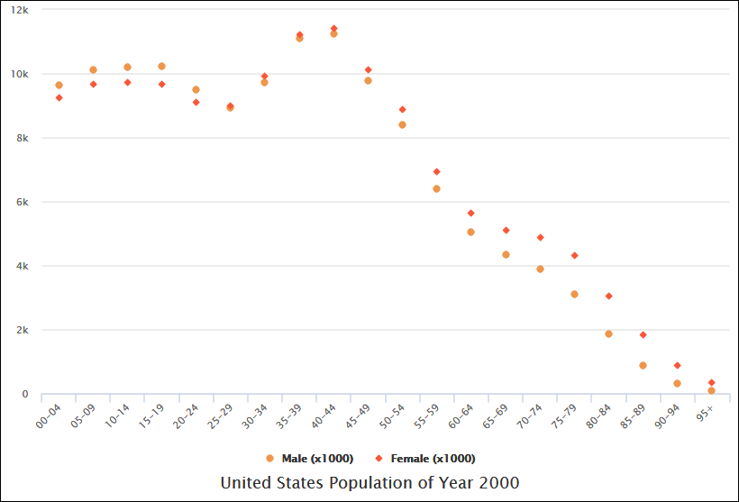
A Scatter Chart (or Scatter Plot) is a type of chart that displays individual data points on a 2D grid, based on two variables — X and Y.
What is a Bubble Chart ?
-
- by Mcs
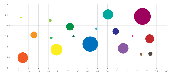
A Bubble Chart is a type of scatter plot where each point is represented by a bubble, and the size of the bubble represents a third data dimension.
What is a Polar Area Chart ?
-
- by Mcs
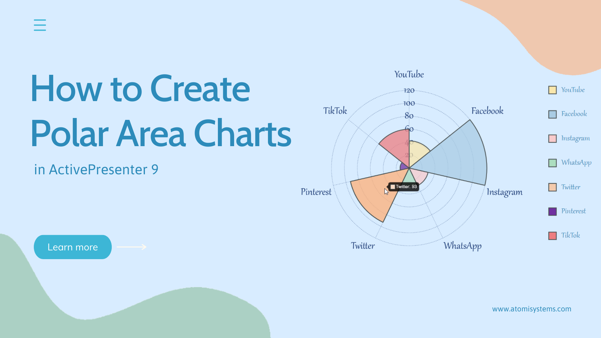
A Polar Area Chart is a circular graph similar to a pie chart, but with a twist:
Each slice has the same angle, and its radius represents the value.
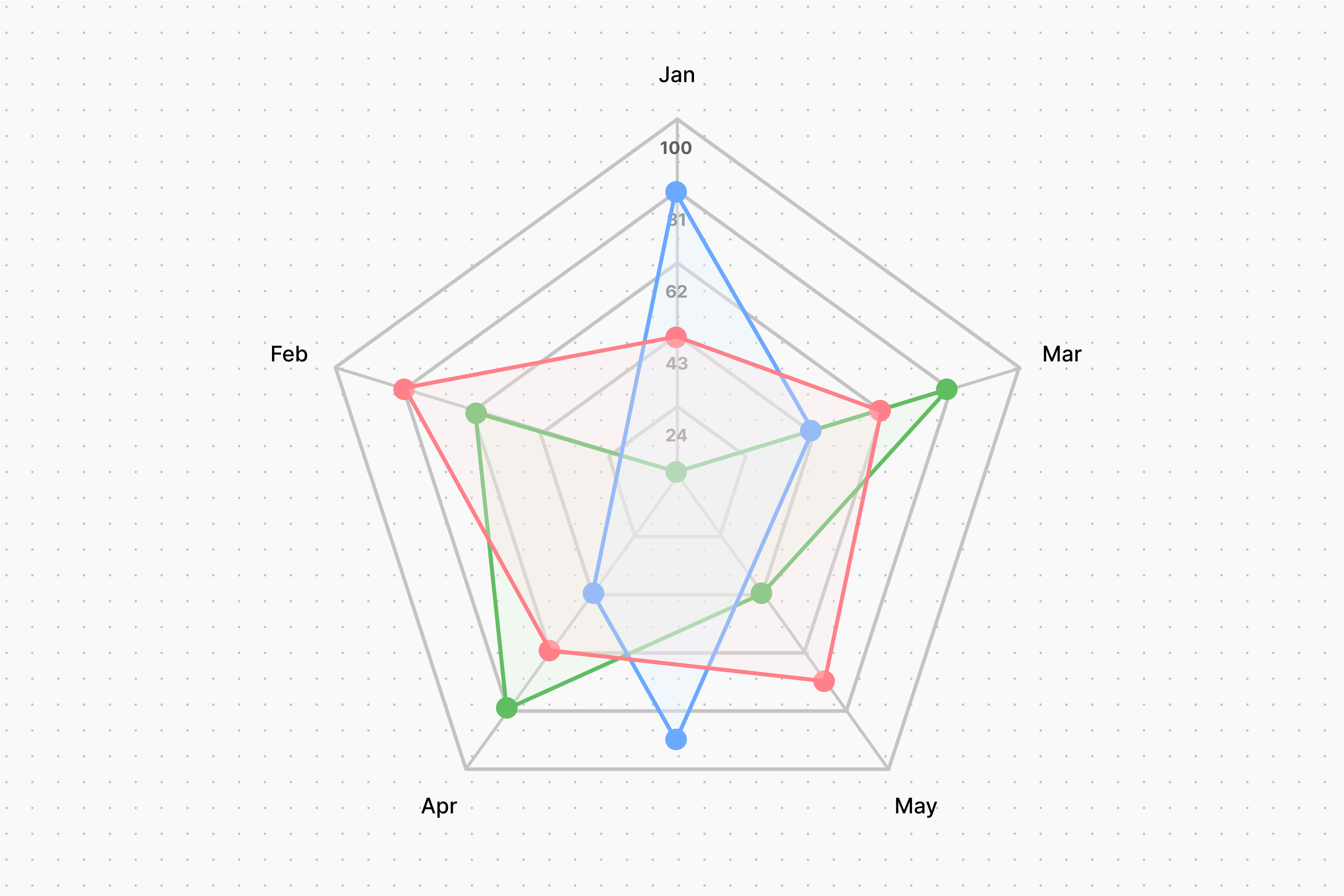
What is a Radar Chart ?
-
- by Mcs
A Radar Chart (also called a Spider Chart or Web Chart) displays multidimensional data on a circular graph. Each axis represents one variable, and values are plotted as…
What is a Doughnut Chart ?
-
- by Mcs
A Doughnut Chart is just like a Pie Chart, but with a hole in the center. It shows proportions of data as slices of a ring — useful for comparing parts of a whole (100%).
What is a Pie Chart ?
-
- by Mcs
A Pie Chart is a circular chart divided into slices to show proportions of a whole. Each slice represents a percentage or fraction of a category compared to the total.
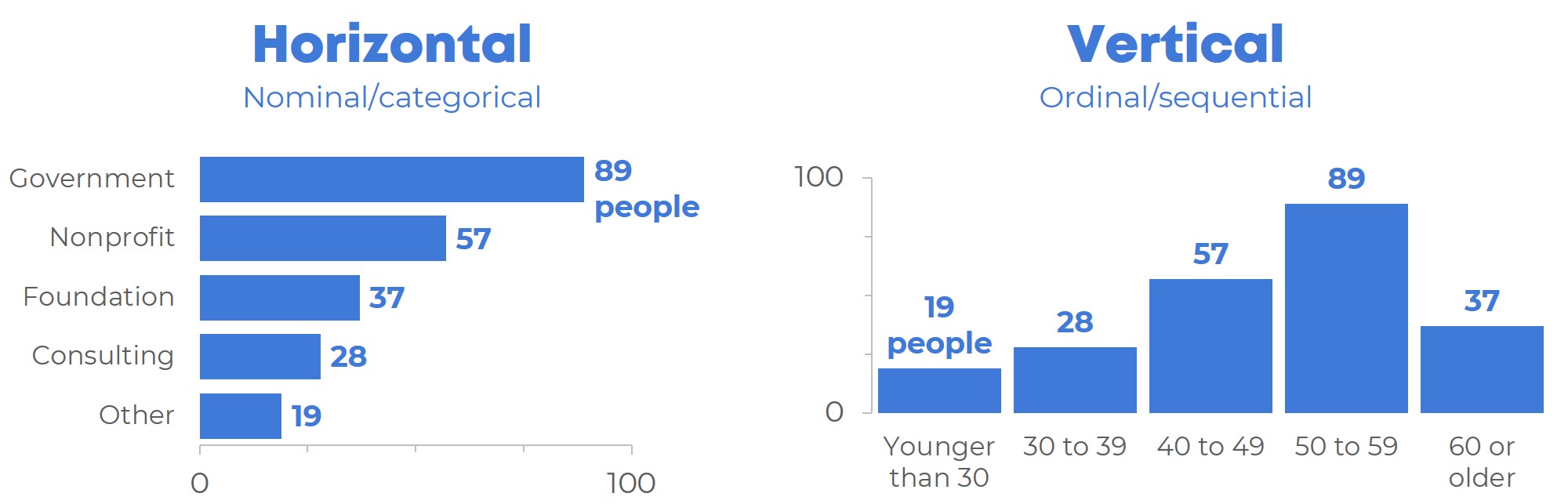
What is a Bar Chart (Horizontal & Vertical) ?
-
- by Mcs
A Bar Chart is a graph that represents data using rectangular bars. Each bar’s length represents the value of the data it shows.
What is a Line Chart ?
-
- by Mcs
A Line Chart is a type of graph that displays information as a series of data points connected by straight lines. It is commonly used to show trends over time.
what is Chart.js ?
-
- by Mcs
Chart.js is a JavaScript library that lets you create beautiful, responsive, and interactive charts using the HTML5 <canvas> element.
We specialize in creating bespoke Drupal websites that are both functional and visually stunning. Our team experienced developers, designers, and strategists works collaboratively to ensure every project meets our high standards of quality and performance.


![]()


@ Mcs. All rights reserved
Comments
Add new comment